
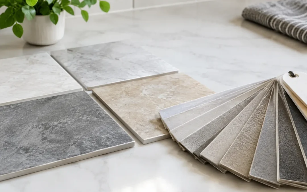
A grout color can make the same tile look quiet and refined, bold and patterned, or visibly dated. That is why choosing grout color for tile should happen before installation, not after the floor or shower wall is finished. The right choice supports the room’s size, lighting, maintenance needs, and the look you want to live with for years.
For homeowners updating kitchens, bathrooms, entryways, and living areas, grout is not a minor detail. It frames every tile. A narrow line repeated across an entire floor becomes a major visual feature, especially with small tile, mosaic, subway tile, or a large open room.
Start With the Look You Want
Most grout decisions come down to three visual directions: blending, contrasting, or landing somewhere in between. None is automatically better. The best option depends on the tile itself and how much attention you want the layout to receive.
A grout color close to the tile color creates a more continuous surface. It is often a strong choice for natural stone, large-format porcelain, and tile with movement or variation. The eye stays focused on the material rather than the grid of grout joints. In a compact bathroom or narrow hallway, a blended grout can also make the room feel less broken up.
A contrasting grout makes each tile stand out. White subway tile with charcoal grout is a familiar example. This approach can add character and define a classic pattern, but it also puts the installation under a spotlight. Uneven tile spacing, irregular cuts, and inconsistent grout joints are easier to notice when the contrast is strong.
A middle-tone grout is often the practical compromise. With white tile, a soft gray may create definition without the sharp maintenance demands of bright white or the graphic effect of dark charcoal. With beige, cream, or warm stone tile, a taupe or light brown grout can do the same job.
Choosing Grout Color for Tile by Room
The room’s purpose matters as much as its style. A grout sample that looks excellent in a design display can be frustrating in a busy family home.
Kitchens and entryways
Kitchen floors, backsplashes near cooking areas, and entryway tile see splashes, soil, and regular cleaning. Very light grout can show tracked-in dirt and cooking residue quickly, particularly on a floor. Very dark grout can hide soil better, but it may show dust, dried cleaner, or mineral deposits depending on the finish and lighting.
For many active kitchens and entryways, a medium warm gray, mushroom, taupe, or earth-toned grout is easier to maintain than either extreme. Match the undertone to the tile. Cool gray grout next to warm beige tile can look accidental, while a warm gray or taupe usually feels more intentional.
Bathrooms and showers
Bathrooms bring a different challenge: soap film, body oils, moisture, and hard-water minerals. In North Central Florida, mineral buildup can leave a pale haze on dark grout and darkened staining on neglected light grout.
On shower walls, choose a color that works with routine cleaning rather than one that demands constant correction. A light gray, soft beige, or color pulled from the tile pattern is often more forgiving than pure white. Shower floors deserve extra attention because small mosaic joints create much more grout surface. A medium shade generally offers the best balance between a clean appearance and realistic upkeep.
Living areas and open floor plans
Large tile floors in living rooms or open kitchens can feel calmer when grout blends with the tile. This is especially true with 12-by-24-inch tile, wood-look plank tile, travertine-look porcelain, and natural stone. A high-contrast grout can turn a broad floor into a pronounced grid, which may be the goal in a modern design but can overwhelm a room with many other finishes.
Before deciding, view a few installed tiles with grout samples in the actual space. Daylight, warm interior bulbs, cabinet colors, wall paint, and window direction all change how the color reads.
Match the Undertone, Not Just the Shade
Homeowners often compare grout colors by lightness alone: white, gray, beige, brown. Undertone is where many otherwise good choices go wrong.
White tile is rarely simply white. It may lean blue, cream, gray, or ivory. Gray tile may contain blue, green, taupe, or purple undertones. Stone-look tile can carry several colors at once. Select a grout that relates to the dominant undertone or to a color you want to bring forward.
For example, cool white marble-look tile often works well with a soft cool gray grout. A yellow-cream ceramic tile may look better with ivory or warm light beige. If a porcelain floor combines tan, gray, and brown veining, choose grout from the middle of that range rather than matching the lightest or darkest vein.
Bring grout chips home if possible, but do not rely on the chip alone. Place it beside several tiles, not just one. Tile variation, especially in porcelain designed to resemble stone or wood, can make a close match look different from tile to tile.
Consider Tile Size, Joint Width, and Pattern
The more grout lines a surface has, the more the color choice matters. A large-format floor with narrow joints may tolerate contrast without becoming busy. Penny rounds, hexagons, basketweave mosaics, and small subway tile contain many more joints, so bold grout becomes a dominant part of the design.
Joint width changes the effect as well. A narrow grout joint in a complementary color can look subtle. The same color in a wider joint becomes much more visible. Textured or handmade-look tile also benefits from a thoughtful choice because its edges and spacing naturally vary. Strong contrast may emphasize those variations, which can be charming in the right setting or distracting in the wrong one.
If your tile has a distinctive pattern, decide whether the pattern or the grout should lead. Patterned encaustic-style tile usually needs a grout that stays in the background. Simple rectangular tile can handle more contrast when you want the layout to become the feature.
Think Honestly About Maintenance
No grout color is maintenance-free. Light grout makes dark stains more apparent. Dark grout can fade, develop a cloudy residue, or show light-colored deposits. Colored grout may also look different after it cures, especially if cleaning products, excess water, or installation conditions affect the final result.
What matters is choosing a color that makes normal use easier to accept. A household with children, pets, or a frequently used rear entry may be happier with a medium-tone floor grout. A guest bathroom with limited traffic may be a good place for a cleaner, lighter look.
Proper cleaning and sealing help preserve the color, but they cannot fix a poor color decision. Avoid harsh acidic cleaners on grout and nearby natural stone. They can weaken grout, dull stone finishes, and create uneven-looking joints over time. Routine cleaning with products suited to the surface is the safer path.
When Existing Grout Is the Problem
If the tile is in good condition but the grout looks permanently stained, uneven, or out of date, replacement is not always necessary. Professional grout color sealing can recolor grout lines while helping protect them from future staining. It can be useful when white grout has become difficult to maintain, when an old color clashes with an update, or when a room needs a more consistent finish.
Color sealing is not a shortcut for damaged grout or loose tile. Cracked, missing, or failing grout needs repair first. The tile and substrate should also be evaluated if recurring cracks, moisture issues, or hollow spots are present. A durable result starts with a sound surface.
Natural Surface Restoration helps homeowners assess whether cleaning, grout repair, color sealing, or a broader tile and grout restoration service makes the most sense for the condition of the surface. Seeing a small test area before committing to a full room can provide the confidence that a color sample alone cannot.
Test Before You Commit
The smartest final step is simple: make a small mockup. Set several tiles together with spacers, apply your top grout choices, and let them dry fully. Look at the sample in morning light, at night with the room lights on, and next to cabinets, countertops, paint, or fixtures.
Do not judge the sample only when it is wet. Grout usually dries lighter, and the difference can be significant. Also look at it from standing height. A color that seems barely different up close may read much darker across an entire floor.
The right grout should make the finished room feel intentional while fitting the way your household actually uses it. When you are unsure, choose the option that supports the tile, handles everyday life gracefully, and gives you confidence every time you walk into the room.